
Google Photos
UX Lead • UX Design • Visual design • Motion design
Auto-organize and
search your photos
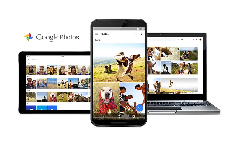
Google Photos at launch in 2015. Blog post
Background
During my five year tenure on the Google Photo's team, the app was Google’s fastest growing and most beloved apps. Google Photos sought to reinvent itself as the private home for all your memories after being spun out of Google+. The app aimed to solve the growing problem of how we find, relive, and share these memories as we take increasingly more photos and videos. Google’s mission is “to organize the world's information and make it universally accessible and useful”. I was entrusted with bringing that mission to Google Photos search UX.
Problem
When users wanted to find a past memory they often scrolled through and tediously looked for photos often to show reluctant but patient onlookers. Google Photos would automatically organize their photos and videos into groups by faces, locations, objects, and other metadata but user research highlighted that browsing those groups or searching for them wasn’t discoverable and perceived to be a novelty – not a reliable utility. 😩 The team knew there was important work to do in terms of improving the accuracy and reliability of the results, but product leadership turned over multiple times. I had to create a compelling vision to guide the team.
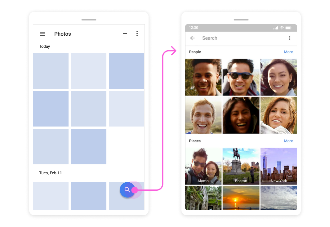
Even if users did see the blue search button, they would often ignore it. Research highlighted that the user's mental model for how photo search would work fell short of what it could do in many cases (E.g. dates and app folders).
Solutions
Uplevel auto-organization
In order to find the right balance between discoverability and user demand, we experimented and incrementally decentralized where auto-organized albums of people, places, & things lived. We also elevated search to the top of the page. Instead of hoping users would understand what search could do for them, we brought auto-organized photo groups into Albums, a top level view of the app.
+400%
Impressions
+70%
Users searching in first week
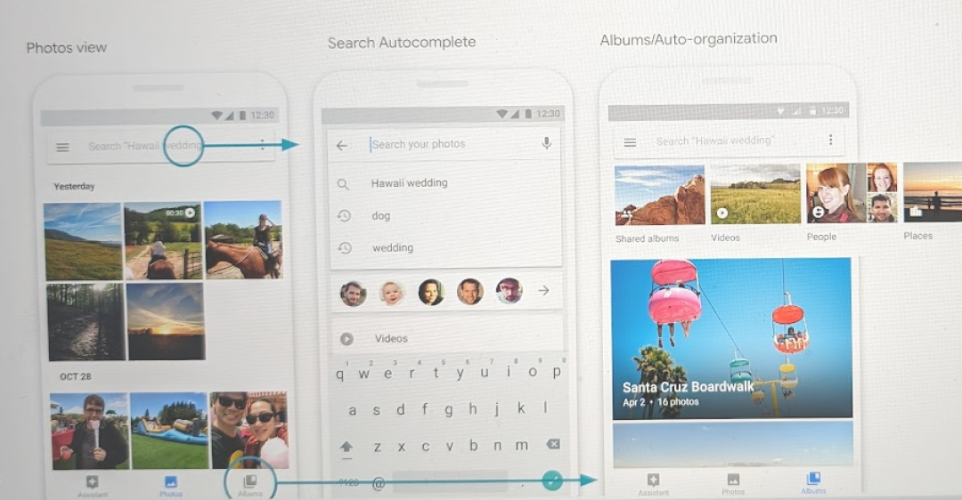
🙄 Apologies for the image quality. Tech companies don't like to share.
Better inboarding
Most users were impressed by the auto-organized albums, but often would stumble upon it when it wasn't needed, so we hypothesized that showing the power of it right after onboarding would convey how Google Photos was different than their previous photo app.
+70%
Users searching on first run
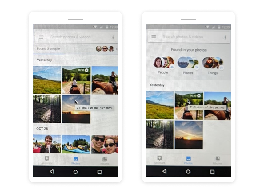
[Left] On first run, an indexing process would be visible in the top of the photo grid. [Right] After the indexing process was complete, we would direct users to where to find them in the Albums tab.
Giving users control
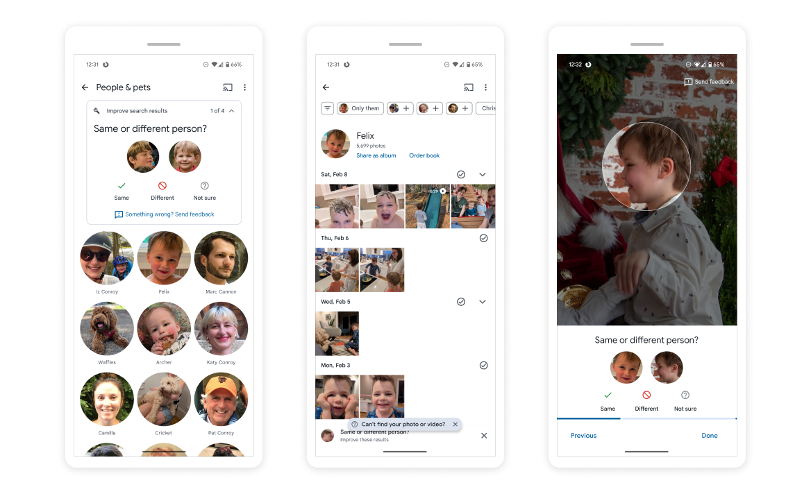
Computer vision is magical, but far from perfect and our users could very quickly see it. While most users wouldn't spend the time fixing its mistakes, we could lean on a small fraction of users who were diligent about removing face tags. I designed the UI suggest near matches or groups that may be the same. In time, as our algorithms got better, the idea is that we would have a strong "groundtruth" dataset to compare to and thereby improve auto-organization for all users.
Emotionally resonant auto-organization
On the team, we talked a lot about how we could really know our users and how we could use that to give them more value out of their photos. At the same time we were adding the ability to favorite or archive photos so they can help us know what is important to them.
Study participants described lists of people, places, and things were organized in no discernable way and in effect felt emotionally stale. I felt we could use our intelligence to highlight groupings and create new ones for important people, places and things. I explored how that might elicit memories of relationships between people, vacations or travel, or hobbies & events.
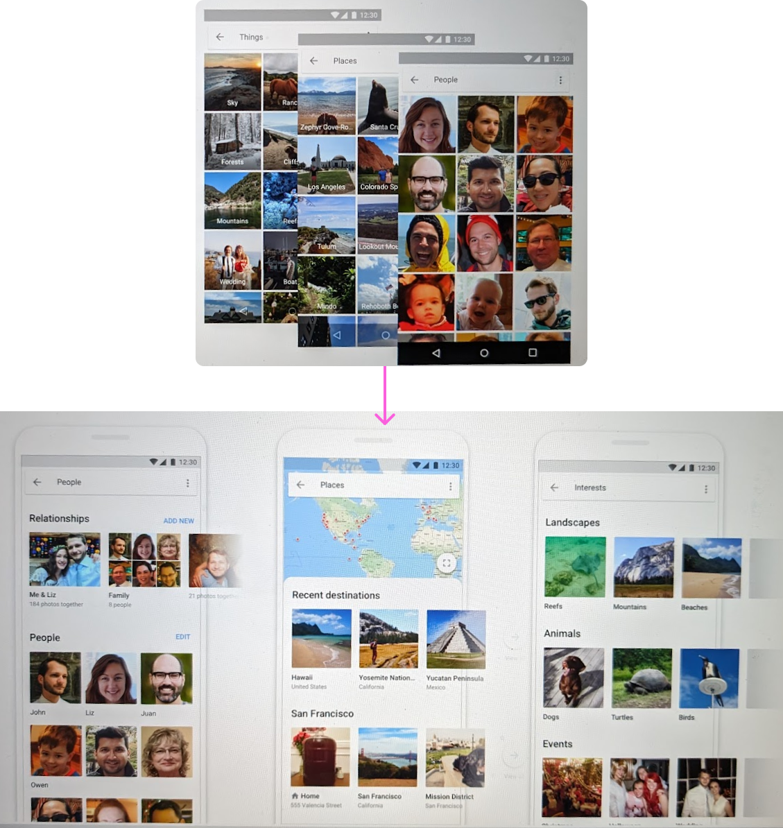
Unfortunately these explorations were never released, but the ideas of helping users relive more emotionally resonant photos lives on in the "Stories" like features showcasing photos from years ago or of you and your significant other, friend, or based on a theme like a special furry friend.
Other contributions
In my time starting on the Google Photos UX team, I was one of six I worked on many parts of the core app experience ahead of and through its launch.
Onboarding
I developed the initial onboarding flow working with the product lead to craft the narrative, created illustration assets using Google’s illustration style guide, and collaborated with a motion designer to bring it to life. We used Lottie to ship this with minimal engineering work.
Within Google, this was held up as a model to emulate for some time until user expectation rightfully got tired of them 😢
I pushed the team to add photo search by emoji, a fun April fool's joke that still works today 🔍
Team
UX team lead: Juan Carlos Anorga
UXR: Elizabeth Shelly
Motion Design: Eric Henry, Sean Monohan
Product: Chris Perry, Alex Roe, Karolina Pyszkiewicz
TL: Jouting Liao, Jason Ting, Andreea Berfield